Brand Identity — 10 / 12

BEPOSabor italiano

ClientBEPO
CategoryBrand Identity
ScopeLogo, Brand System, Packaging
IndustryItalian Food · Takeaway
Year2024

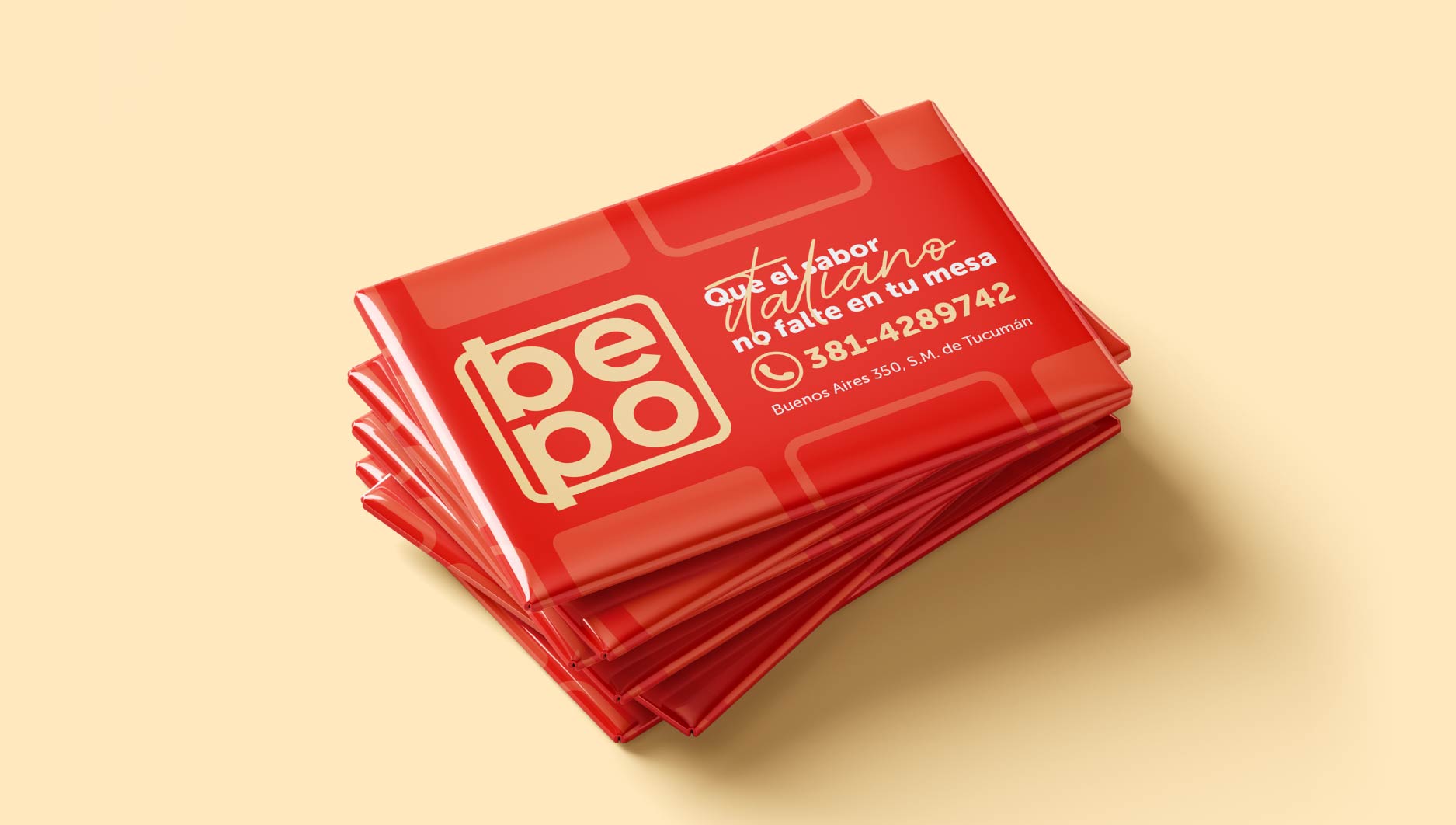
BEPO brings Italian comfort food to the streets of San Miguel de Tucumán — fresh pasta, slow red sauce, and a single promise: that "el sabor italiano" never misses your table.

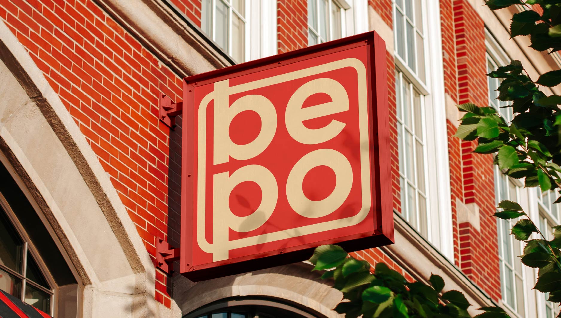
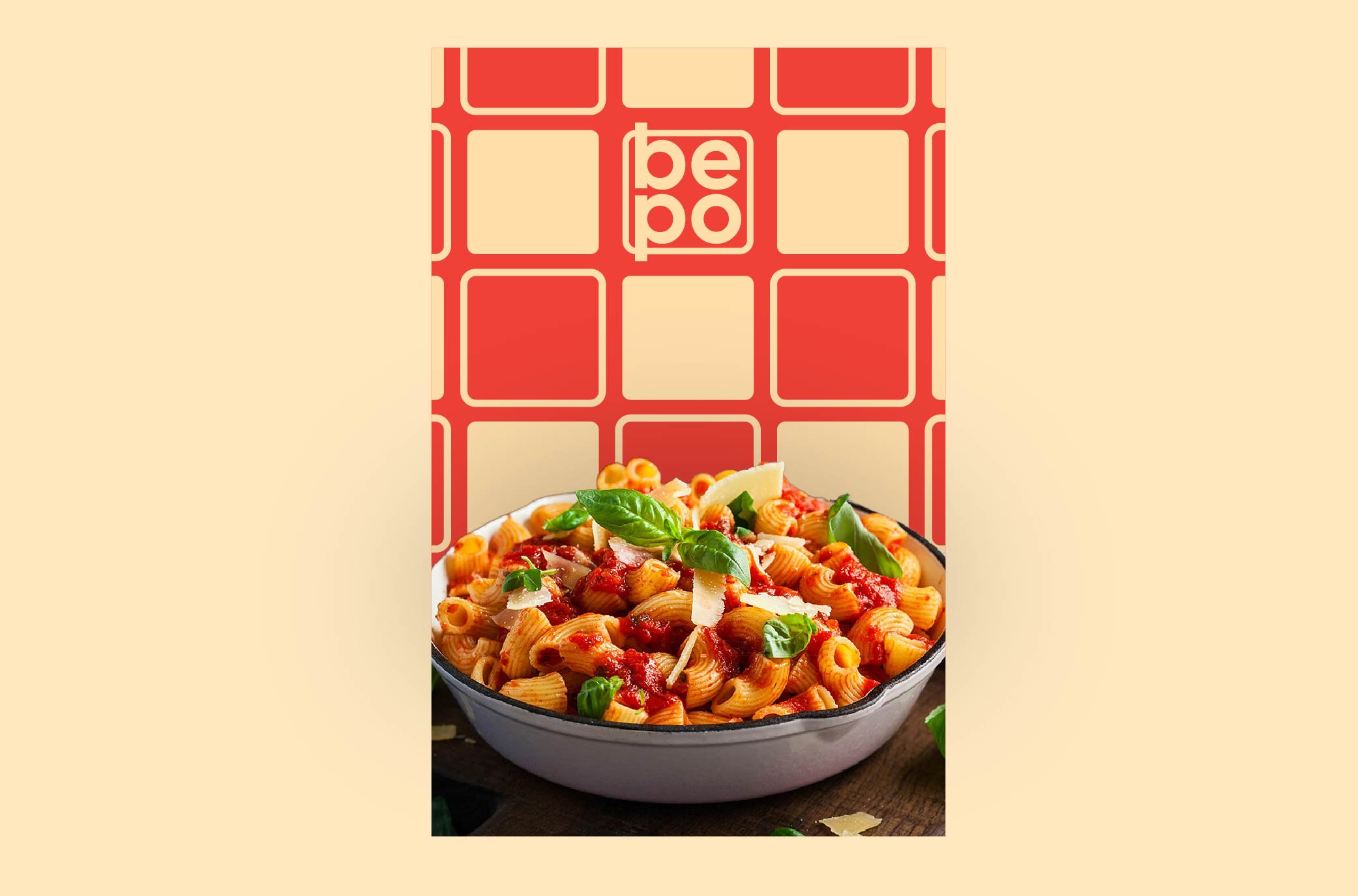
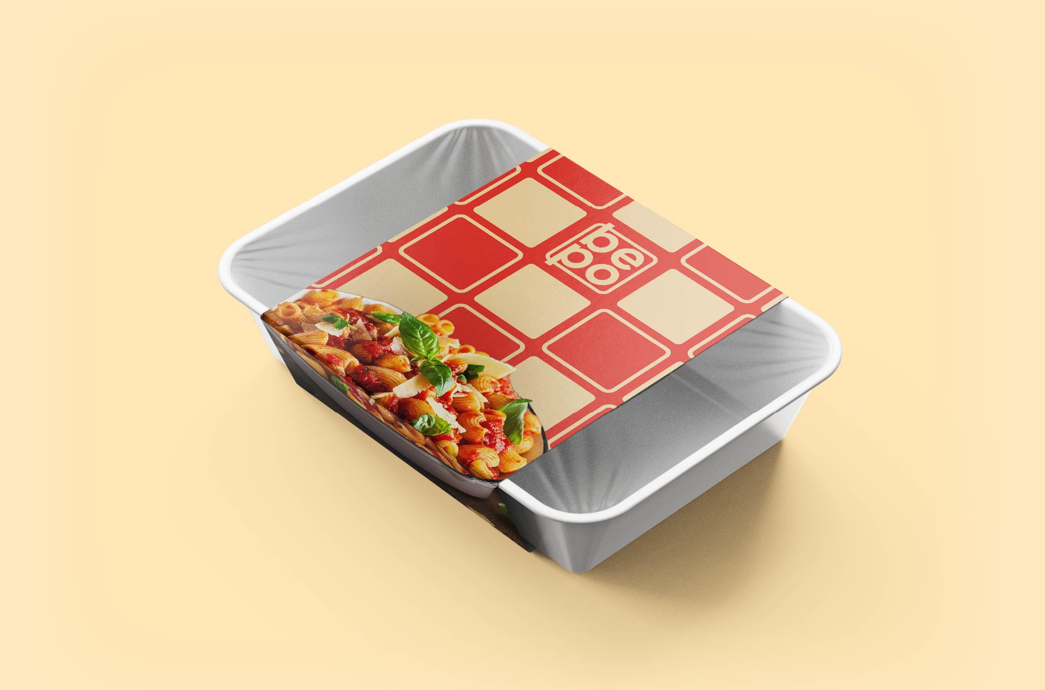
The identity is built around a warm, rounded lowercase mark and a playful grid of tiles — half tomato red, half pasta cream. Appetising, friendly, and impossible to miss on a busy corner.

Logo Design Brand System Packaging Pattern Signage
BEPO tile pattern with brand mark
Logo construction Grid & geometry
BEPO logo construction grid

The wordmark stacked into a tight, rounded square — "be" over "po" — built on a geometric grid so the mark reads instantly whether it's a metre-wide sign or a thumbnail.

Logo construction — 2024
Brand applications Signage, cards & stickers
BEPO exterior signage on brick facade
Exterior signage
BEPO business cards
Business cards
BEPO sticker sheet
Stickers
Packaging & promo Poster & takeaway
BEPO pasta promo poster
Promo — Pasta poster
BEPO takeaway packaging
Packaging — Takeaway tray

Next project

Xclusive Barber